
Five Common Mistakes Beginners Make with Satellite Imagery
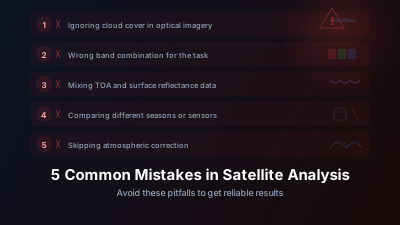
Quick Answer: The most common mistakes: confusing spatial and temporal resolution tradeoffs, ignoring atmospheric correction, assuming cloud-free means analysis-ready, treating all 'green' pixels as vegetation, and not checking the acquisition date. Each one can silently ruin your analysis.
Learning from Others' Mistakes
The five most common mistakes: confusing the four resolution types, skipping atmospheric correction, trusting cloud masks blindly, assuming every green pixel is vegetation, and ignoring acquisition dates. Each one can silently ruin an analysis without producing a single error message.
The same mistakes come up again and again among people new to satellite imagery — not because they are careless, but because satellite data has unintuitive properties that trip up anyone coming from a non-remote-sensing background. Here's how to avoid them.
1. Confusing Resolution Types
"What's the resolution?" is the first question everyone asks. The answer is usually more complicated than they expect, because satellites have four types of resolution:
Spatial resolution (pixel size): Sentinel-2 is 10m, meaning each pixel represents a 10×10 meter area on the ground. This is what most people mean by "resolution."
Temporal resolution (revisit time): How often the satellite returns to image the same location. Sentinel-2 revisits every 5 days, Sentinel-1 every 6 days.
Spectral resolution (number and width of wavelength bands): Sentinel-2 has 13 bands spanning visible through shortwave infrared. A panchromatic camera has 1 broad band.
Radiometric resolution (bit depth): How many brightness levels each pixel can distinguish. Sentinel-2 uses 12-bit encoding (4,096 levels).
The mistake is optimizing for one dimension while ignoring the others. A satellite with 50cm spatial resolution but a 30-day revisit is useless for monitoring a weekly phenomenon. A daily satellite with only RGB bands can't calculate NDVI.
Before selecting a data source, define what you need across all four dimensions.
2. Ignoring Atmospheric Correction
Raw satellite images include the atmosphere between the sensor and the ground. Aerosols, water vapor, and molecular scattering all affect the measured signal. In a raw Sentinel-2 scene, a substantial share of the blue band signal can come from the atmosphere rather than the ground surface — blue is the worst-affected band because Rayleigh scattering rises steeply toward shorter wavelengths. There is a full explanation of why atmospheric correction matters; the short version:
- Comparing scenes from different dates with different atmospheric conditions produces spurious "changes" that aren't real
- Calculating indices like NDVI from uncorrected (TOA) reflectance gives different results than from corrected (BOA) reflectance
- Absolute reflectance values from uncorrected data are physically meaningless
The fix: Use atmospherically corrected products. Sentinel-2 Level-2A (L2A) is already corrected — use it instead of Level-1C (L1C). ESA's correction processor, Sen2Cor, is described by the agency as "a processor for Sentinel-2 Level 2A product generation and formatting; it performs the atmospheric-, terrain- and cirrus correction of Top-Of-Atmosphere Level 1C input data" — that's exactly the step you'd otherwise be skipping. If your data source only provides TOA data, apply a correction algorithm before analysis.
Most modern platforms — including Off-Nadir Delta — serve the corrected L2A product by default. But if you're downloading data directly, for example from the Copernicus Data Space Ecosystem, always check which processing level you're getting.
3. Can You Trust the Cloud Mask?
Not completely. Automated cloud masks are good but imperfect, and treating them as gospel is the third mistake. The Scene Classification Layer (SCL) in Sentinel-2 L2A classifies each pixel as cloud, cloud shadow, water, vegetation, bare soil, etc. — but edge cases are common enough that you should always verify visually:
- Thin cirrus is often missed, leaving a milky haze over the image
- Bright sand or concrete can be misclassified as cloud
- Cloud shadows are detected inconsistently, especially over water
- Snow/cloud confusion is a persistent problem in mountainous regions
An analysis that trusts the cloud mask completely can quietly include heavily contaminated pixels in a time series — and an NDVI anomaly that looks like a fire signal can turn out to be a cloud shadow.
The fix: Visual inspection. Before running any quantitative analysis, look at the true-color image. If an area looks hazy, suspicious, or inconsistent with surrounding pixels, investigate before trusting the numbers.
4. Assuming All "Green" Is Vegetation
In true-color satellite imagery, many things appear green that aren't vegetation:
- Algal blooms in water bodies
- Green roofing material
- Certain rock types with copper mineralization
- Athletic fields with artificial turf
More subtly, NDVI doesn't distinguish between vegetation types. A manicured lawn, a rice paddy, a tropical rainforest, and a field of weeds can all produce similar NDVI values. The index tells you "there's chlorophyll here" but not much about what kind of vegetation, its ecological value, or its land use context.
The fix: Cross-reference with other data. High NDVI in an unexpected location deserves investigation — check the spatial pattern, time-series behavior, and surrounding context before concluding that it's the feature you're looking for.
5. Forgetting to Check the Date
This sounds basic, but it's remarkably common. A satellite image has a specific acquisition date and time. Comparing an image from summer with one from winter without accounting for seasonal differences is a recipe for false conclusions.
Less obviously:
- Time of year affects sun angle, which changes shadows and reflectance values
- Agricultural fields change rapidly — the same field can be bare soil, green crop, or golden harvest within weeks
- Tidal state matters for coastal analysis — low tide exposes features that high tide submerges
- SAR images from different times of day aren't directly comparable if freeze/thaw cycles are relevant (relevant at high latitudes)
The fix: Always annotate your analysis with acquisition dates. When making comparisons, use imagery from the same season (ideally the same month) across years. And for time-sensitive phenomena, check the exact acquisition time, not just the date.
How Bad Can Each Mistake Get?
What makes these five dangerous is not the size of the error but its shape. Each one produces a plausible-looking result rather than a failure:
| Mistake | How it shows up in the output |
|---|---|
| Wrong resolution type | The phenomenon you care about happens between overpasses, so the time series is smooth and confident — and silent about the events |
| Ignoring atmospheric correction | Scene-to-scene index shifts that look like real change, because the atmosphere differed between the two dates |
| Trusting the cloud mask completely | Thin cirrus and unflagged cloud shadow enter the "clear" pixel pool and drag index values in a direction that mimics stress |
| Assuming all green = vegetation | Algal blooms, artificial turf, and green-painted surfaces produce vegetation-like index values in places with no vegetation |
| Ignoring acquisition date | Phenology alone moves NDVI across most of its usable range between seasons, dwarfing any real change signal |
The worst outcomes come from mistakes #2 and #5 compounding each other: comparing atmospherically uncorrected images acquired in different seasons. Seasonal phenology and uncorrected atmospheric effects can add together rather than cancel, so a stable forest can appear to be in dramatic decline. Neither error announces itself in the output — the analysis simply returns a spurious result.
What Do These Mistakes Have in Common?
All five share a root cause: treating satellite imagery as if it were a photograph. It's not. It's a quantitative measurement of electromagnetic radiation, with specific geometric, spectral, temporal, and radiometric properties that must be understood to use the data correctly.
The good news is that once you internalize these concepts, they become automatic. After a few months of working with satellite data, checking the processing level, inspecting cloud masks, and accounting for acquisition dates becomes second nature.
Start building those habits now, and you'll avoid months of confusion later. Our getting started guide walks through the basics of working with satellite data in Off-Nadir Delta.

Remote sensing specialist with 10+ years in satellite data processing and AI. Founder of Off-Nadir Lab. Ph.D. in Informatics (Yokohama National University, 2026). Master's in Earth System Science and Technology (Kyushu University). Co-author, Remote Sensing Encyclopedia. More about the author →