
Urban Heat Islands from Space: Mapping City Temperatures with Thermal Satellites
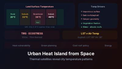
Quick Answer: Satellites measure land surface temperature (LST) using thermal infrared bands, revealing urban heat island (UHI) patterns where cities are 2-8°C warmer than surrounding rural areas. Landsat thermal band provides 100m resolution LST; ECOSTRESS provides 70m with multiple daily overpasses. Dark roofs, asphalt, and concrete absorb solar radiation and re-emit as heat; vegetation cools through evapotranspiration. Satellite LST maps guide urban planning — identifying hotspots for tree planting, cool roof mandates, and park placement. Key limitation: LST ≠ air temperature; surface temperatures can be 10-20°C higher than air temperature on hot days.
During the June 2022 European heat wave, NASA's ECOSTRESS instrument on the ISS mapped land-surface temperature across Paris. The resulting image shows the pattern clearly: the hottest surfaces stand out across the built-up core, while parks, vegetation and water register as distinctly cooler islands within the same city on the same day.
This intra-urban temperature variability is invisible to weather stations (which typically measure air temperature at a few locations) but clearly revealed by satellite thermal sensors. It's also where the actionable information lives — knowing which neighborhoods are hottest tells city planners where interventions will have the greatest impact.
How do satellites measure surface temperature?
Every surface emits thermal infrared radiation according to its temperature (Planck's law), and satellites measure this emitted radiation in the thermal infrared window (8-14 μm), where the atmosphere is relatively transparent. The measurement is then corrected for atmospheric absorption and surface emissivity to produce land surface temperature (LST) — the physics is unpacked in our guide to land surface temperature and thermal sensing.
Thermal Infrared Emission
The measured radiance is converted to brightness temperature, then corrected for:
- Atmospheric effects: Water vapor and other gases absorb and re-emit thermal radiation, warming the apparent temperature of cool surfaces and cooling the apparent temperature of warm surfaces
- Surface emissivity: Different materials emit thermal radiation at different efficiencies. Vegetation emissivity (~0.98) is higher than concrete (~0.92) or metal roofs (~0.20-0.60). Ignoring these differences biases the retrieved LST, and the error is largest over low-emissivity surfaces such as bare metal roofing
Key Thermal Sensors
| Sensor | Resolution | Revisit | LST Accuracy |
|---|---|---|---|
| Landsat 8/9 TIRS | 100m | 16 days | ±1.5°C |
| ECOSTRESS (ISS) | 70m | Variable (1-5 days) | ±1.5°C |
| MODIS | 1km | Daily (day + night) | ±1°C |
| Sentinel-3 SLSTR | 1km | Daily | ±1°C |
| ASTER | 90m | On request | ±1.5°C |
For urban studies, Landsat 8/9's thermal instrument and ECOSTRESS provide the spatial resolution needed to distinguish individual neighborhoods, blocks, and parks. ECOSTRESS was built to measure "the temperature of plants to better understand how much water plants need and how they respond to stress," as NASA puts it — but its 70m thermal data from the ISS has proved equally valuable for city-scale heat mapping.
What causes the urban heat island effect?
Cities run warmer than their surroundings because impervious surfaces store solar energy, vegetation that would cool through evapotranspiration has been removed, buildings and vehicles add waste heat, and street canyons trap radiation. No single factor dominates everywhere — which is why mapping the pattern matters more than the citywide average. In detail, cities are warmer due to:
Impervious surfaces: Asphalt and concrete absorb solar radiation during the day and release it slowly at night, keeping urban areas warm after sunset.
Reduced vegetation: Trees cool their environment through evapotranspiration — converting water to vapor consumes energy that would otherwise heat the air. Removing vegetation removes this cooling mechanism.
Waste heat: Air conditioning, vehicles, industrial processes, and human metabolism release heat directly into the urban environment.
Canyon geometry: Tall buildings trap radiation through multiple reflections between walls and reduce wind-driven ventilation.
Surface color: Dark roofs and roads absorb more solar radiation than lighter surfaces.
Typical UHI Magnitudes
The surface UHI (measured by satellite LST) varies with climate, city size, and season:
- Temperate cities: 3-8°C surface UHI on hot summer days
- Tropical cities: 2-5°C (smaller because surrounding vegetation is also warm and humid)
- Arid cities: Sometimes negative — irrigated urban vegetation can be cooler than surrounding desert (the "oasis effect")
- Nighttime: UHI often stronger at night (2-5°C) than during the day in some cities, because urban thermal mass retains heat longer
Mapping Intra-Urban Temperature Variability
The most valuable insight from satellite thermal data isn't the city-vs-rural temperature difference — it's the temperature variation within the city:
Cool islands: Parks, rivers, tree-lined streets, green roofs Hot spots: Industrial zones, large parking lots, dark commercial roofs, highway interchanges
A single Landsat thermal scene reveals these patterns across an entire metropolitan area, providing information that would require hundreds of ground-based temperature sensors to replicate.
Relating LST to Urban Form
Statistical analysis of satellite LST against urban morphology data reveals which factors most strongly predict surface temperature:
- Vegetation fraction: The strongest predictor in most studies — more canopy consistently means lower surface temperature. The size of the cooling per unit of added canopy varies substantially between studies, cities and climates, and is smaller for air temperature than for surface temperature, so treat any single conversion factor as site-specific.
- Impervious surface fraction: Strong positive correlation with LST. Tracking how impervious cover spreads over years is the subject of urban sprawl monitoring with satellite time series.
- Building height/density: Complex relationship — tall buildings create shade (cooling) but also trap heat (warming). Net effect depends on geometry and orientation.
- Surface albedo: Higher albedo (lighter surfaces) correlates with lower LST.
- Proximity to water: Lakes and rivers provide localized cooling. The effect is strongest at the shoreline and fades with distance inland, with the reach depending on the size of the water body, wind direction and how built-up the adjacent land is.
Applications
Heat Vulnerability Assessment
Combining satellite LST maps with demographic data identifies heat-vulnerable communities — neighborhoods that are both hot and populated by people at higher health risk (elderly, low-income, outdoor workers). These vulnerability maps guide:
- Emergency heat response (cooling center placement)
- Long-term infrastructure investment (tree planting, park creation)
- Public health outreach during heat waves
Urban Planning and Zoning
Satellite thermal data informs urban development decisions:
- Green infrastructure placement: Where will new parks have the greatest cooling effect?
- Cool roof policies: Which commercial districts would benefit most from reflective roofing?
- Development standards: Requiring minimum vegetation fraction or maximum impervious coverage in new developments
- Climate-adaptive design: Orienting streets for wind channeling, mandating shade structures
Monitoring Greening Interventions
Cities investing in urban greening (tree planting, green roofs, park creation) can use satellite LST to monitor the thermal impact:
- Pre-intervention LST baseline
- Post-intervention LST comparison
- Quantification of cooling benefit per unit of green infrastructure investment
This evaluation capability makes thermal satellite data valuable for justifying continued investment in urban greening programs.
Energy Demand Estimation
Urban temperature directly affects cooling energy demand. Satellite LST data at neighborhood resolution enables:
- Spatial estimation of cooling energy requirements
- Identification of areas where energy poverty and heat exposure overlap
- Assessment of how urban greening reduces peak cooling demand
How Urban Surfaces Rank Thermally
What matters when reading a thermal scene is the ordering of surfaces, not an absolute number — the actual temperatures depend on air temperature, insolation, wind, moisture and time of overpass. On a hot, sunny summer day, urban surfaces sort consistently from hottest to coolest roughly like this:
| Surface Type | Relative Daytime LST | Why |
|---|---|---|
| Dark asphalt parking lot | Hottest | Very low albedo; almost all incoming solar radiation is absorbed |
| Flat dark commercial roof | Very hot | Low albedo, no shading, no evapotranspiration |
| Concrete pavement | Hot | Higher albedo than asphalt but still impervious and dry |
| Bare soil (dry) | Warm to hot | Varies strongly with albedo and moisture content |
| Light-colored / cool roof | Moderate | Higher albedo reflects much of the incoming radiation |
| Grass lawn | Moderate to cool | Some evapotranspiration, but little shading |
| Green roof (vegetated) | Cool | Evapotranspiration plus an insulating substrate |
| Dense tree canopy (park) | Coolest land surface | Shade plus sustained evapotranspiration |
| River / lake surface | Coolest overall | High heat capacity; evaporative losses |
The practical takeaway for satellite analysis: the extreme hotspots in an urban thermal scene are usually large, dark, dry, impervious surfaces — commercial roofs, parking lots and industrial yards — while the cool islands are canopy, water and irrigated green space. Adding canopy and raising surface albedo both move a neighborhood down this ordering; how much cooling a specific intervention delivers has to be measured locally rather than assumed from a rule of thumb.
Is land surface temperature the same as air temperature?
No — and this is the most common misreading of thermal satellite data. LST is the temperature of the surface itself, which responds faster and more extremely to solar radiation than the air above it. On a hot day the two can differ by 10-20°C or more, so satellite heat maps should be read as maps of relative exposure, not as forecasts of what a thermometer will show.
On a hot summer day, an asphalt parking lot may have an LST of 65°C while the air temperature 2 meters above it is 38°C. A nearby park may have an LST of 30°C with air temperature of 32°C.
The differences between LST and air temperature:
- LST responds faster and more extremely to solar radiation
- LST varies more spatially (meter to meter) than air temperature
- Air temperature at standard measurement height (2m) integrates conditions over a larger area
- LST is what the satellite measures; air temperature is what people experience
For health impact assessment, air temperature is more relevant than LST. But satellite LST is a useful proxy — areas with high LST generally have higher air temperatures too, even if the absolute values differ.
Diurnal Patterns
Single daytime satellite overpasses capture peak heating conditions but miss the full thermal cycle. The nighttime UHI is often more important for human health — people can't recover from daytime heat stress if nighttime temperatures remain high.
MODIS provides both daytime (~13:30) and nighttime (~01:30) LST, enabling analysis of the full diurnal UHI cycle at 1 km resolution. ECOSTRESS, with its variable overpass time, samples different times of day, providing a more complete picture of the urban thermal regime.
The interplay between daytime heating (driven by solar absorption) and nighttime cooling (driven by thermal mass and ventilation) determines the net health impact of urban heat — and satellites are the only practical tool for mapping this at city-wide scale. Thermal data also pairs naturally with other urban indicators: nighttime lights trace where activity concentrates, NO₂ and PM2.5 observations add the air quality dimension, and tracking vegetation and built-up indices over a district with area monitoring records how the main drivers of urban heat — canopy loss and impervious expansion — change season by season.

Remote sensing specialist with 10+ years in satellite data processing and AI. Founder of Off-Nadir Lab. Ph.D. in Informatics (Yokohama National University, 2026). Master's in Earth System Science and Technology (Kyushu University). Co-author, Remote Sensing Encyclopedia. More about the author →